
How middle grade trends, ancient alchemy, and Indiana Jones helped shape my new graphic novel cover.
One of the many cool yet exhausting things about making graphic novels is the chance to design your own book cover. It’s a blessing and a curse to be the one creating the image standing between your story and its potential audience. No pressure, it’s just the cover, which you’re probably being asked to work on while you’re still FINISHING YOUR BOOK. But I digress. We’re here to focus on the long and winding road to an effective cover. Some of you may be fellow comics people looking for insight, and some of you are just morbidly curious.
Over the next few posts, I’ll cover what I know about getting the job done, from publishing marketing goals to a painstakingly tweaked color palette. All in service of the image gracing the cover of my new graphic novel, Snake Night. School Library Journal called the book “An adventurous introduction to dark academia for middle grade readers,” and I think the cover art arrives at the same conclusion. But how did I get there? Let’s find out!
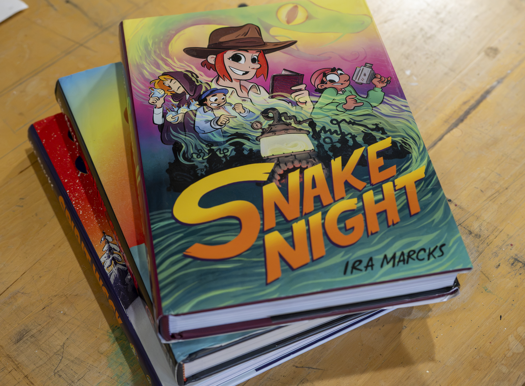
Photo by Alison Bachorik
PART 1: Identifying a Target Audience
I need to start off by pointing out that designing this cover was not a journey I went on alone. For context, Snake Night was published with LB Ink, the graphic novel imprint of Little, Brown, one of America’s oldest book publishers. Working with a traditional “Big Five” publisher means there’s an anonymous (to me, anyway) marketing team expecting certain things from my cover image, and a few guiding voices in my inbox making sure I’m meeting those expectations.
The guiding voices are my book’s editor, Andrea Colvin, and designer, Megan McLaughlin. Andrea and Megan rule, and I loved working with them. Snake Night marks our third time working together on a cover, so we’ve got a good shorthand, which isn’t to suggest this is a short project. It’s not. With masterful patience, Andrea and Megan share the creative goal of steering me toward an image that connects with my book’s target audience. So, let’s get started with an essential opening question:
Who is the target audience for this cover?
The good news is, this question was answered years ago when I initially pitched my book. It’s worth pointing out to the uninitiated that a graphic novel is typically sold on pitch materials (a few pages of sample art and a story outline), not a completed work. When an editor decides to acquire a graphic novel project, they already have a potential audience in mind.
When I signed my contract for Snake Night, it was with the understanding that I would be making a book for young readers ages 8–12. Within this “middle grade market,” there are many niche audiences: kids who like historical retellings, kids who like superheroes, kids who like dog men and warrior cats, and, my target audience, kids who are getting into creepy stuff.
“Creepy stuff” is how I might describe my book to a kid. But here behind the scenes, I want to share a more essential term I use to focus my work for young readers. I think of my books as “kids vs. confidence” stories.
I would describe “kids vs. confidence” stories as ones that focus on contemporary-minded preteens struggling with uncertainty about their own abilities and self-worth. They’re set around significant experiences with academics, athleticism, and artistry, and brought to a tipping point by friendships and family responsibilities. These are stories about the big emotions that accompany the little steps forward. Why are these kinds of stories important? Because as we grow up, these experiences start to feel trivial, like bumps in the road to adulthood. They’re stories easily forgotten, and often, so are the lessons learned along the way.
A “kids vs. confidence” story can be set in the real world or a supernatural world. The stakes can feel equally high in both. It’s just as dramatic to face a school bully in the locker room as it is to face a troll bully that lives under a bridge. When all is said and done, the reader should be cheering for the kid protagonists to come out the other end of the journey more self assured than when they went in.
Lots of authors make “kids vs. confidence” type stories and have for a long, long time. And while I’ve got my favorite references, from the history of book cover art, I think it’s wildly important to check out what’s working in the market right now. Who knows, I might find a new favorite author to shout out in a post! Here are covers for three recent middle grade graphic novels with a “kids vs. confidence” flavor, utilizing some of my favorite genres: fantasy/adventure, supernatural mystery, and (the best genre) metaphorical library. Aside from these books being great stories, the covers are super effective:
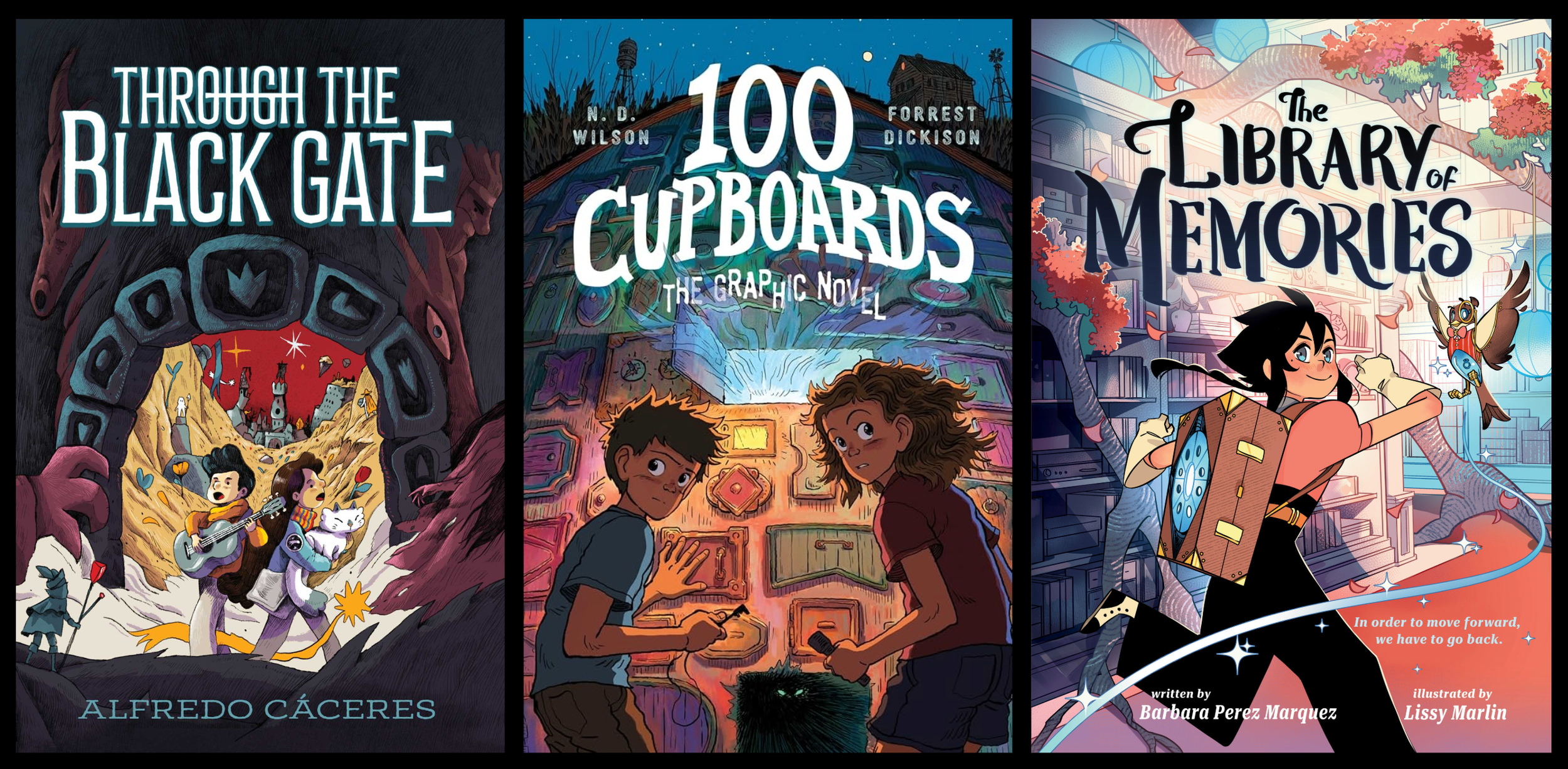
Through the Black Gate by Alfredo Cáceres | 100 Cupboards by N.D. Wilson & Forrest Dickison "| The Library of Memories by Barbara Perez Marquez & Lissy Marlin
Let’s take a moment to break down their effectiveness. While the covers feel fresh and new in their artwork, below the surface is a tried-and-true design formula. The formula breaks down to a simple description: a world-building set piece framing the story’s protagonist(s) in moments of focus, curiosity, and/or fearful hesitation, with body language assuring readers of a story packed with kinetic cartoon energy.
Deciding to use the formula is the easy part. Making it work for my story is where things get complicated. With a target market identified, and a sense of what’s working in the here and now, I move on to gathering reference materials.
PART 2: Gathering Reference Material
According to my Pinterest account I really enjoy collecting reference pics for projects that will NEVER see the light of day. (evidence below)
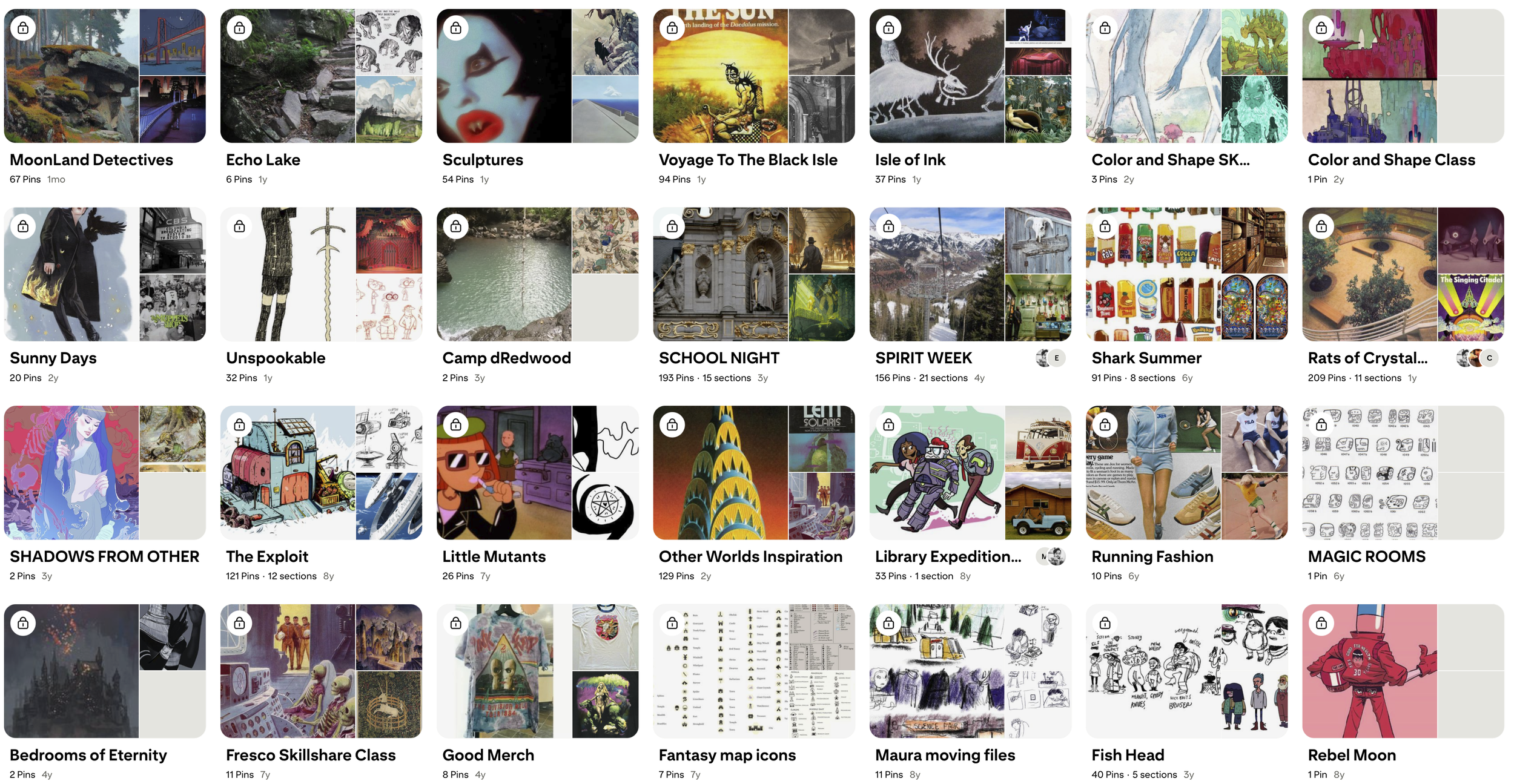
But Snake Night is not one of those projects! It exists and the Snake Night Pinterest board guided a lot of the narrative thinking behind it. This collection was huge influence on my story’s set pieces (plot-based spaces that put my characters into emotional motion). The most important set pieces in the book are variations on laboratories that my characters Rose, Elijah, Kelvin, and Li visit in their attempt to decode a mysterious alchemical experiment.
I wanted my cover to capture the dangerous fun my characters faced as they’re messing around with ancient pseudoscience. I’m convinced an alchemical lab set piece is the right choice because 1) it’ll make for a thematic and eye-catching visual, and 2) it’ll give my characters a thing to emotionally react to. Win-win.
When gathering reference material for an alchemical lab I avoided fictional interpretations and focused on the weird verisimilitude of these historical spaces. One part institutional chemistry lab, one part magician’s lair.
The reference image at the top of my board was this page from an alchemical text published in 1677 titled Mutus Liber (Latin for “Wordless Book”). Despite the title, the image holds one of those great alchemical phrases that twists back in on itself (like a snake): “All things from one, and all things into one.”
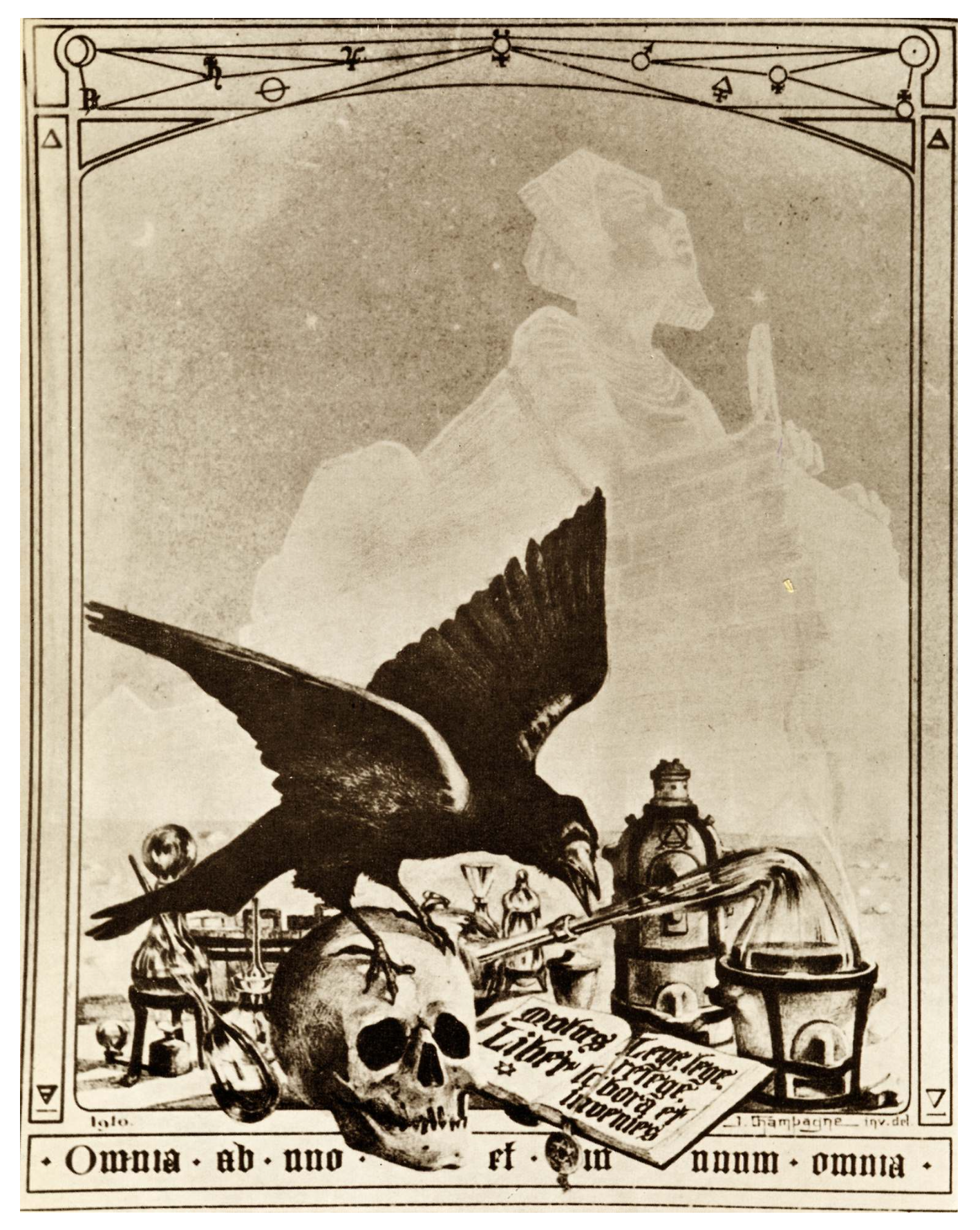
An illustrated page from Mutus Liber (1677)
Other tone-setting reference images include a vintage photograph of the French occultist/alchemist François Jollivet-Castelot working in his lab and the painting “The Alchemist Discovering Phosphorus” by the English painter Joseph Wright of Derby. I particularly love the uncanny lighting effect in Wright’s painting, so keep an eye out for that influence in my early mock-up covers.
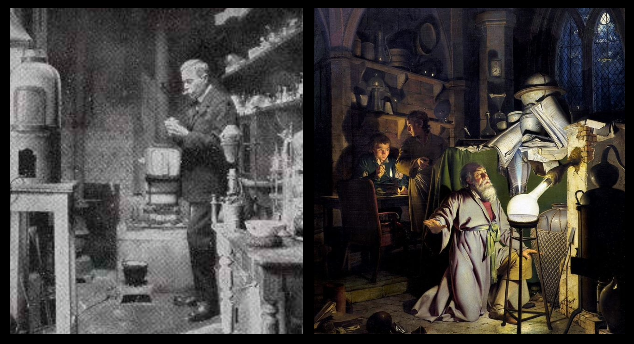
François Jollivet-Castelot working in his lab (early 1900s) | “The Alchemist Discovering Phosphorus” by Joseph Wright of Derby (1771, reworked 1795)
I’m pairing my fascination with alchemical esoterica with my love for pop culture filmmaking. The adventures of Indiana Jones were a huge influence on the visual storytelling in Snake Night. They helped me balance the deeper alchemical weirdness with lite pulpy adventure.
The world of Indiana Jones was designed by artists who are masters of narrative composition. Steven Spielberg screenshots aside, my mood board included Richard Amsel’s theatrical poster for Raiders of the Lost Ark and Drew Struzan’s promotional art for the Indiana Jones ride at Disneyland.
Sure, maybe Indiana Jones is a reference lost on kids today, but I want to point out that the character is really just a big kid with confidence issues. I mean, he spends a whole movie trying to show his dad he’s a good archaeologist.
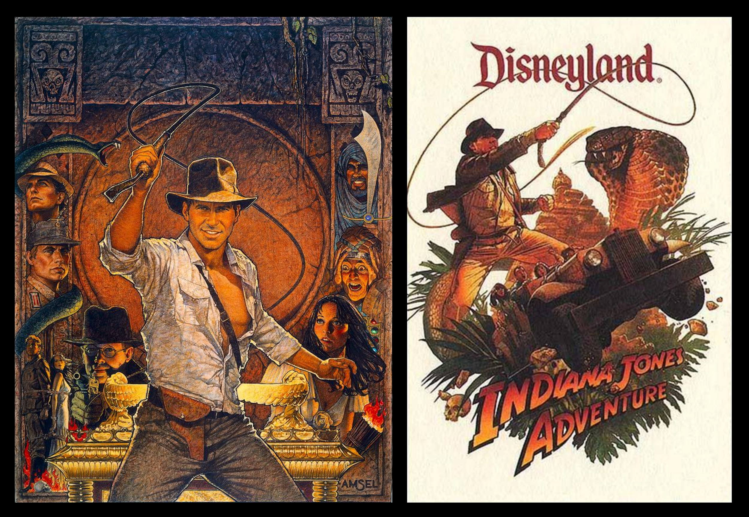
Raiders of the Lost Art theatrical poster by Richard Amsel (1982) | Indiana Jones Adventure promotional poster by Drew Struzan (1995)
Lest I forget, this book cover isn’t just a summation of my influences. It’s also the third in my Midnight Movie Adventures series, which includes Shark Summer (2021) and Spirit Week (2022).
Shark Summer outsells Spirit Week by a mile, so it pretty much went unsaid among the whole team that the Snake Night cover should resemble what made the Shark Summer cover so sellable. I love both covers, but when you look at them next to each other, the composition of Shark Summer (creepy animal stalking the main protagonist) sure hits harder.
We’re about to wrap things up for this post, so while you’re waiting, I might suggest my old blog posts on the Shark Summer and Spirit Week cover art.
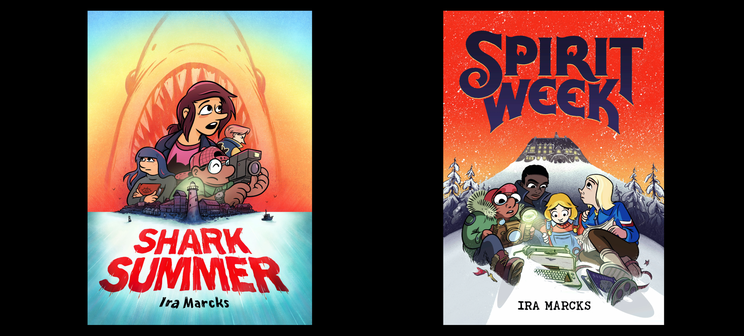
Shark Summer by Ira Marcks (2021) | Spirit Week by Ira Marcks (2022)
Target audience? Check. Reference images? Check. It’s time to begin the long and iterative trek through cover mock ups and indecipherable sketches. Join me next time for part two of this exciting/exhausting adventure!
