Designing a cover for SHARK SUMMER
Getting to design the cover of your own book is a lot of fun, but it’s not without its own unique challenges. Here is the full story of creating the cover art for my middle grade graphic novel, Shark Summer.
Part 1 : Four concept sketches
Long before a graphic novel is released with a major publisher, the author must start planning their cover art. It's the first sign that the marketing team is giving your upcoming book attention. That's a thrilling feeling. But also a little stressful because, odds are, you do not have a complete vision for the book yet. A cover image is so important in the world of publishing and there are lot of cooks in the kitchen through the process. You'd be surprises at how many iterations happen before a final design is settled on. Below are the initial four concepts I submitted to my editorial team and a few notes on their response:
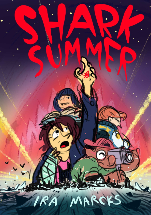
Concept 1 : This one was the favorite for all of us. Sometimes a composition just comes out 90% of the way there and while this one needs a few changes, the overall vibe is strong. I focused on capturing the core character trait of each of the book's four main kids through body language and props. Maddie is the storyteller so she gets a book, Elijah is the filmmaker so he gets the camera, Lex is our antagonist so she's lookin' mysterious in the background, and Gayle is our main POV character and we follow her struggles/conflicts very closely.
To fit the aesthetic of my book (vintage summer blockbusters) this concept is referencing movie poster design, especially the work of Drew Struzan. He's a master of big head collage style of poster design and worked on all the famous franchises - Indiana Jones, Back to the Future and Star Wars. Of course, I needed to shout out JAWS in the design so you can see the iconic shark head looming behind the main characters.
My editing team loved this one but the marketing team said the shark references were too subtle. They made the case that most potential customers of the book will be introduced to it as a tiny thumbnail on Amazon so the visual elements (like the shark!) need to pop out. I see their point and will be addressing this concern in a follow-up sketch (see part 2.
Concept 2: Shark Summer is a bit of a horror story. It's not super scary (it is a kids' book after all) but it's got scary parts for sure. I spent a lot of my childhood being afraid of book covers. Especially Stephen King covers.
Personally, I love when book art gives me the chills so I thought I'd take a stab at a scarier book cover design. My editorial team wasn't as fond of this concept. It's a bit too literal as it looks like the kids are truly in danger in this image. Those sharks look like they might actually eat the kids, unlike the first concept where the shark fins are more, I dunno, metaphorical or something. I agree with them but I think the emotional response to the color palette is just as menacing. The blue-sick-green coloring evokes both darkness and seasickness. That's a pretty terrifying feeling to imagine. This concept was quickly scrapped but I do really like the way Gayle's eyes look here.
Concept 3 : You'll quickly notice this cover concept is a little looser. It's not a design I was very passionate about but I did want to present another option. This one is riffing off film-noir with its hyper-stylized shadow play.
Of the three this one feels most surreal and off-kilter. It's not as balanced as the previous two and while I think it's cool and unique it's just not what I really want for this adventure story. If I did use this concept, I'd also redraw Gayle so she's less freaked out and a bit more confident.
Surprisingly, the marketing team liked this one! Upon further questioning, it was revealed that they liked the way it was 'most sharky'. As in, you could shrink the image way down and still recognize the shark. It always pays off to ask a client/collaborator 'what do you mean by that?' when they state an option. Odds are they don't have the language (or time) to get specific without a little nudge. In a composition, every element of visual design influences the others so I always gotta ask "what specifically do you appreciate about this image?" or "what's getting in the way of this working for you?"
Concept 4 : Of these four, this concept is most refined because it's left over from my original book pitch (What's a pitch? Check out my class on pitching graphic novels to find out!). This design is cute, but it's a bit sillier than I'm looking for on a cover. I do like the 'working together' aspect of the characters poses! This is my first take on a more refined type treatment. There's a ways to go from here but you'll notice this influence the final text.
Part 2 : Refining the concept with more sketches
After reviewing those four initial sketches for a cover design with my editor and the marketing team at Little Brown Young Readers, I set out to refine the most well received designs. Everyone on the team had a positive response to Concept 1 so I decided to iterate on that design and see what happed.
Concept 5 : I started by making some changes in character placement and body language. Given that SHARK SUMMER is targeting a middle grade audience (kids ages 8-12) I thought it'd be best to heighten the sense of wonder in the characters faces. I ended up spending a draw rethinking the pose and facial expression on the book's protagonist, Gayle (the girl with the brown hair and cast on her arm). I was really struggling to get the look I wanted so I turned to one of my favorite illustrators for inspiration. I've always been a fan of the character designs on Drew Struzan's movie posters, so I based my new expression for Gayle on Princess Leia's expression on one of his iconic Star Wars posters. This is the sense of wonder I was imagining:
The story of Shark Summer begins as a light adventurous summer romp but as it goes on you find a looming sense of supernatural forces that add depth to the story. So, I got it in my head to bring some of that fantastical energy to these two new concept sketches through the use of color. The big change here is swapping out the red for a more green/blue color. To me this evokes the magical/creepy feeling I get from photos of the Aurora Borealis.
Concept 6 : There was a positive response to the 'shark shadow' in Concept 3 so I tried a variation on that. This one might be too abstract and honestly, I have my heart set on Concept 5 so I'm not trying too hard to impress here.
Concept 7 : I'm still open to whatever suits the team so I tried a second variation with a different approach to the 'shadow shark' idea. I've stumbled into this cool triangle shape for the fins. I like the movement they bring to the scene and I actually went back and revised the fins in Concept 5 before I sent it out.
I guess the lesson here is don't get stuck on an idea even when you know it's a good one! In fact, by going in a totally different direction and exploring the 'shadow shark' concept for a while I was able to circle back and improve something I was completely happy with.
Part 3 : Focusing in on one concept
After sharing seven concepts for the Shark Summer cover art with my editor, designer and marketing team, Concept 5 is the clear winner and will influence the next round of sketches. My editor had only one bit of criticism, something to this effect - "It certainly is sharky. But it's not very summery." It can be hard to juggle all the elements cover art needs to be successful, and I guess I'd dropped the 'summer' ball on this one. I got too caught up with the supernatural vibe.
Luckily, the issue lies in the color choices so it's an easy fix. My use of color is a major part of my storytelling. If you'd like to know how I go about making my choices take a look at my class, World of Color.
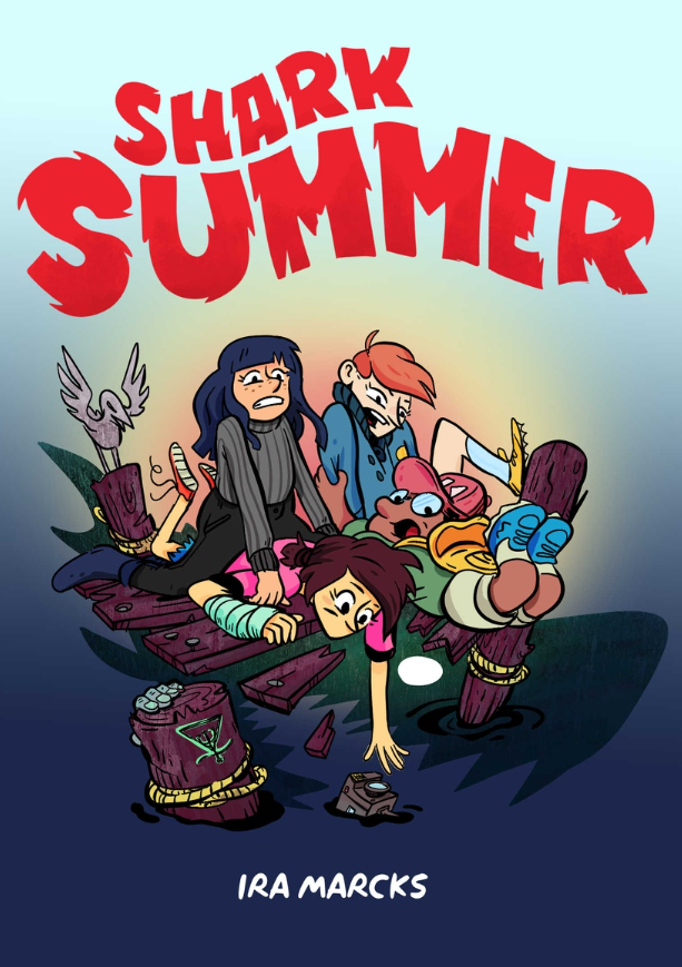
Summer is finally here! Now, with everyone on board (boat joke!) with the new color direction, I could start finalizing the art. There is a relief that comes from locking in the final composition of a cover. But it also signifies a new, and for me more challenging process; finalizing the art! You know that phrase 'the devil is in the details'? It's true. If I recall correctly, there are about 10 'final' version of the cover art that exist between the two images below. No matter how long you work as a visual artist, it never gets any easier to bring the image you have in your head to the paper. The only thing that changes is your persistence and the belief that you'll eventually get there.
When it comes to designing a cover for a middle grade graphic novel there's nothing more important than the FACES and EXPRESSIONS. Looking at these two versions you'll notice signifiant and subtle revisions in the character designs themselves. Compare the skin tone, feature proportion, eye direction, etc, from 'final' art 1 and 'final' art 2. I'll sat it again: it's all about faces :)
And there you have it! The Final Final Art you see above is the actual cover art for the book. It took months of work but I got there and I couldn't be happier with the results.


