
Iteration and Ideas
Let’s look at a word that is a big part of my creative process. That word is: ITERATION. Iteration is more popularly know as a mathematical concept: the means of reaching closer approximations of a solution to a problem.
I often think of myself as a designer. When I’m in the mode of working as a visual artist/designer, for example if I’m designing a cover for one of my books, I consider my creative process to be an ‘iterative’ journey to a design solution. It’s a bit like I’m zooming in on a bigger idea until I can see it for all its smaller parts. Once I can see the parts, I zoom back out and, hopefully, the right composition has begun to reveal itself. If it hasn't, I try again. Some of the key elements of my final design might appear early on, but the way they fit together takes time, trial, and error. There are no dead ends when I’m iterating. And there are certainly no wrong choices. There is only me, my tools, my big idea, and the pursuit of a visual solution.
Sometimes a creative process can feel endless. It’s one of the feelings that prevents us from starting (or finishing) a project. But the concept of iteration feels safe to me. I like to imagine my process will have an inevitable conclusion, or a solution, that is awaiting me… as long as I keep zooming in. I know this is all a very abstract thing to say. So I’ll share an example of what I’m talking about.
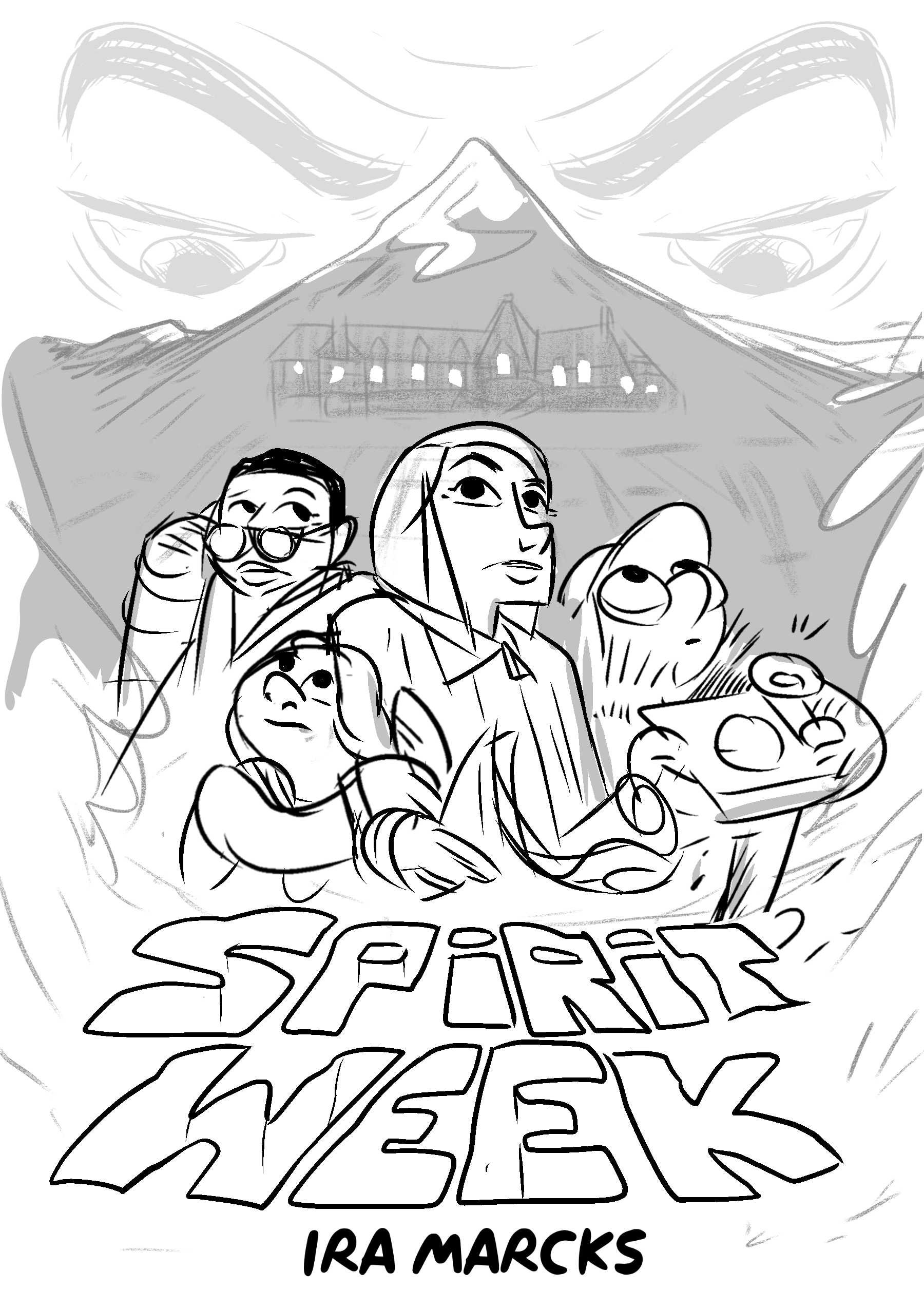
So, I have a book about to debut called SPIRIT WEEK. And that book has a cover. And that cover has a whole bunch of iterations that happened behind the scenes. I’m not going to explain my thought process behind each sketch, I’m going to leave that to your imagination.
What I will share is my design problem: to create a single image that represents the plot, themes, and characters in my book (without giving too much away). Below I’ll share the genre of the book, a brief summary of the plot, and the inspiration behind the story. At the end of all the iterations, I’ll share SPIRIT WEEK's final cover. You can decide for yourself if I found the right solution to my design problem.
Good luck in your own iterations, or whatever you call your process when you need to get the work done :)
~
SPIRIT WEEK is a horror/mystery graphic novel for young readers. The story was inspired by the legacy of Stanley Kubrick's film, The Shining.
Aspiring engineer Suzy Hess is invited to the famous Underlook Hotel, domain of the reclusive horror writer Jack Axworth, in the mountains above her hometown of Estes Park, Colorado. Suzy thinks she’s there to tutor Jack’s son, Danny, but instead she finds herself investigating a local curse that threatens the landmark hotel.
With the help of Elijah Jones, an amateur filmmaker who thought he’d been asked to make a film about the so-called King of Horror; Rena Hallorann, the hotel’s caretaker; and Danny, who knows more than he’s letting on, Suzy sets out to solve the mystery at the heart of the Underlook, one that holds the town of Estes Park in its grasp. With only a week to save the hotel—and the town—the friends find themselves racing against time to uncover the shadows of the past.


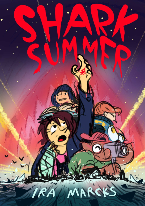
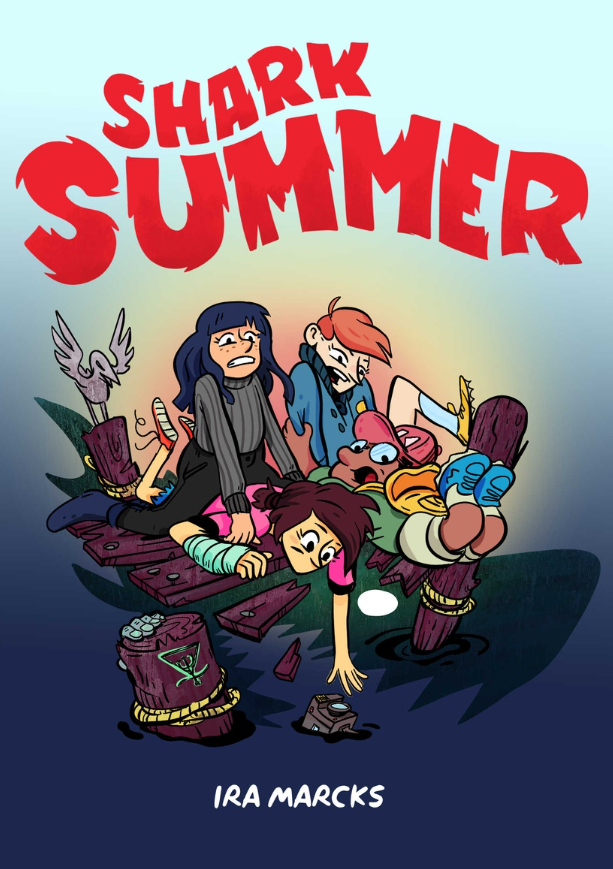
Designing a cover for SHARK SUMMER

Getting to design the cover of your own book is a lot of fun, but it’s not without its own unique challenges. Here is the full story of creating the cover art for my middle grade graphic novel, Shark Summer.
Part 1 : Four concept sketches
Long before a graphic novel is released with a major publisher, the author must start planning their cover art. It's the first sign that the marketing team is giving your upcoming book attention. That's a thrilling feeling. But also a little stressful because, odds are, you do not have a complete vision for the book yet. A cover image is so important in the world of publishing and there are lot of cooks in the kitchen through the process. You'd be surprises at how many iterations happen before a final design is settled on. Below are the initial four concepts I submitted to my editorial team and a few notes on their response:


Concept 1 : This one was the favorite for all of us. Sometimes a composition just comes out 90% of the way there and while this one needs a few changes, the overall vibe is strong. I focused on capturing the core character trait of each of the book's four main kids through body language and props. Maddie is the storyteller so she gets a book, Elijah is the filmmaker so he gets the camera, Lex is our antagonist so she's lookin' mysterious in the background, and Gayle is our main POV character and we follow her struggles/conflicts very closely.
To fit the aesthetic of my book (vintage summer blockbusters) this concept is referencing movie poster design, especially the work of Drew Struzan. He's a master of big head collage style of poster design and worked on all the famous franchises - Indiana Jones, Back to the Future and Star Wars. Of course, I needed to shout out JAWS in the design so you can see the iconic shark head looming behind the main characters.


My editing team loved this one but the marketing team said the shark references were too subtle. They made the case that most potential customers of the book will be introduced to it as a tiny thumbnail on Amazon so the visual elements (like the shark!) need to pop out. I see their point and will be addressing this concern in a follow-up sketch (see part 2.
Concept 2: Shark Summer is a bit of a horror story. It's not super scary (it is a kids' book after all) but it's got scary parts for sure. I spent a lot of my childhood being afraid of book covers. Especially Stephen King covers.
Personally, I love when book art gives me the chills so I thought I'd take a stab at a scarier book cover design. My editorial team wasn't as fond of this concept. It's a bit too literal as it looks like the kids are truly in danger in this image. Those sharks look like they might actually eat the kids, unlike the first concept where the shark fins are more, I dunno, metaphorical or something. I agree with them but I think the emotional response to the color palette is just as menacing. The blue-sick-green coloring evokes both darkness and seasickness. That's a pretty terrifying feeling to imagine. This concept was quickly scrapped but I do really like the way Gayle's eyes look here.
Concept 3 : You'll quickly notice this cover concept is a little looser. It's not a design I was very passionate about but I did want to present another option. This one is riffing off film-noir with its hyper-stylized shadow play.

From THE STRANGER ON THE THIRD FLOOR (1940)
Of the three this one feels most surreal and off-kilter. It's not as balanced as the previous two and while I think it's cool and unique it's just not what I really want for this adventure story. If I did use this concept, I'd also redraw Gayle so she's less freaked out and a bit more confident.
Surprisingly, the marketing team liked this one! Upon further questioning, it was revealed that they liked the way it was 'most sharky'. As in, you could shrink the image way down and still recognize the shark. It always pays off to ask a client/collaborator 'what do you mean by that?' when they state an option. Odds are they don't have the language (or time) to get specific without a little nudge. In a composition, every element of visual design influences the others so I always gotta ask "what specifically do you appreciate about this image?" or "what's getting in the way of this working for you?"
Concept 4 : Of these four, this concept is most refined because it's left over from my original book pitch (What's a pitch? Check out my class on pitching graphic novels to find out!). This design is cute, but it's a bit sillier than I'm looking for on a cover. I do like the 'working together' aspect of the characters poses! This is my first take on a more refined type treatment. There's a ways to go from here but you'll notice this influence the final text.
Part 2 : Refining the concept with more sketches
After reviewing those four initial sketches for a cover design with my editor and the marketing team at Little Brown Young Readers, I set out to refine the most well received designs. Everyone on the team had a positive response to Concept 1 so I decided to iterate on that design and see what happed.

Concept 5 : I started by making some changes in character placement and body language. Given that SHARK SUMMER is targeting a middle grade audience (kids ages 8-12) I thought it'd be best to heighten the sense of wonder in the characters faces. I ended up spending a draw rethinking the pose and facial expression on the book's protagonist, Gayle (the girl with the brown hair and cast on her arm). I was really struggling to get the look I wanted so I turned to one of my favorite illustrators for inspiration. I've always been a fan of the character designs on Drew Struzan's movie posters, so I based my new expression for Gayle on Princess Leia's expression on one of his iconic Star Wars posters. This is the sense of wonder I was imagining:

The story of Shark Summer begins as a light adventurous summer romp but as it goes on you find a looming sense of supernatural forces that add depth to the story. So, I got it in my head to bring some of that fantastical energy to these two new concept sketches through the use of color. The big change here is swapping out the red for a more green/blue color. To me this evokes the magical/creepy feeling I get from photos of the Aurora Borealis.


Concept 6 : There was a positive response to the 'shark shadow' in Concept 3 so I tried a variation on that. This one might be too abstract and honestly, I have my heart set on Concept 5 so I'm not trying too hard to impress here.
Concept 7 : I'm still open to whatever suits the team so I tried a second variation with a different approach to the 'shadow shark' idea. I've stumbled into this cool triangle shape for the fins. I like the movement they bring to the scene and I actually went back and revised the fins in Concept 5 before I sent it out.
I guess the lesson here is don't get stuck on an idea even when you know it's a good one! In fact, by going in a totally different direction and exploring the 'shadow shark' concept for a while I was able to circle back and improve something I was completely happy with.
Part 3 : Focusing in on one concept
After sharing seven concepts for the Shark Summer cover art with my editor, designer and marketing team, Concept 5 is the clear winner and will influence the next round of sketches. My editor had only one bit of criticism, something to this effect - "It certainly is sharky. But it's not very summery." It can be hard to juggle all the elements cover art needs to be successful, and I guess I'd dropped the 'summer' ball on this one. I got too caught up with the supernatural vibe.
Luckily, the issue lies in the color choices so it's an easy fix. My use of color is a major part of my storytelling. If you'd like to know how I go about making my choices take a look at my class, World of Color.


Summer is finally here! Now, with everyone on board (boat joke!) with the new color direction, I could start finalizing the art. There is a relief that comes from locking in the final composition of a cover. But it also signifies a new, and for me more challenging process; finalizing the art! You know that phrase 'the devil is in the details'? It's true. If I recall correctly, there are about 10 'final' version of the cover art that exist between the two images below. No matter how long you work as a visual artist, it never gets any easier to bring the image you have in your head to the paper. The only thing that changes is your persistence and the belief that you'll eventually get there.
When it comes to designing a cover for a middle grade graphic novel there's nothing more important than the FACES and EXPRESSIONS. Looking at these two versions you'll notice signifiant and subtle revisions in the character designs themselves. Compare the skin tone, feature proportion, eye direction, etc, from 'final' art 1 and 'final' art 2. I'll sat it again: it's all about faces :)


And there you have it! The Final Final Art you see above is the actual cover art for the book. It took months of work but I got there and I couldn't be happier with the results.

Using Triadic Colors in Character Design
Choosing colors is a big part of how design a character. Here’s my process for choosing a new palette.

I begin by filling in one of the character’s defining attributes (like the skin, hair, clothing, or artifact/weapon) with a single color. I think it’d be cool if this elf dude had red/orange skin:

I like to use what’s known as the ‘triadic color’ theory to help me develop the rest of my color scheme. According to the theory I should try adding a complementary green as well as a slightly more analogous purple/blue.

I use the triadic color scheme to establish the base colors of my characters other important aspects. I’m using the green for his shirt and the purple/blue for the hair:

From there I continue developing my palette, including shadows and highlights. But I never stray too far from the triadic theory. This helps maintain the bold contrast found in my original three colors. Here’s the finished result:

This technique is a great way to develop eye catching color schemes that help distinguish you characters. Give it a shot!
Good Week #2: Good Story

Excerpts from my newsletter, Good Week. Not signed up? Join here.

1. Vermont's Center for Cartoon Studies (an amazing place to study visual storytelling) is offering a free email-based 'cartooning workout.' It starts when you sign up here and goes for consecutive seven days. I'm enjoying it myself and plan to try it with my students.

2. Lessons From a Screen Play is one of my favorite YouTube channels. Start with the Ghostbusters episode. The lesson here: A story is only a good as the people who tell it. (9 min)

3. Cartoonist Will Eisner is one of history's greatest visual storytellers. He taught America to take comic books seriously. This episode of the podcast, Imaginary Worlds, digs into Eisner's legacy. Take a listen, then get a copy of Eisner's book on the principles of comic art. (35 min)

4. Printed Matter, Inc. is the world's largest public archive of independently published works. Their catalog includes thousands of comics that stretch the art form like it was a glob of silly putty.

5. In 1995(maybe), not long after it became possible to share comics on the web, comic theorist Scott McCloud identified a new opportunity for computer savvy cartoonists that he called the infinite canvas. The mainstream never caught on but the history of the medium is worth exploring.
Good Week #1: Operating Instructions
Content from the first ‘issue’ of my newsletter. Not signed up? Join here.

1. Why make art? Watch Picasso paint some things and you'll get a taste of the pure joyfulness that only art can evoke. (2 min)

2. Maps of imaginary places RULE. The LotR Project is the ultimate tribute to J.R.R Tolkien's world and characters but the map is the coolest part. (∞ min)

3. Speaking of imaginary places... Manylands is a shared pixel art universe of 100,000 spaces and millions of objects. Wander around and/or make your own things. I don't play many video games but I get super inspired by collaborative, interactive art. (∞ min)

4. Reach for the Stars is a beautiful mashup of scenes from films about space exploration. Good stories are honest depictions of the human condition and space is the perfect setting to explore ourselves. Warning: this video will make you want to watch Apollo 13. (3 min)

5. Words from a brilliant mind: “Literature is the operating instructions. The best manual we have. The most useful guide to the country we’re visiting, life.” —Ursula K. Le Guin, from her essay “The Operating Instructions”
Happy Women Director Awareness Month y'all

Sofia Coppola's desk (199?)
Did you know September is Women Director Awareness Month? Here are five films and a music video to help you celebrate.
Wayne's World (1992). Directed by Penelope Spheeris. After making some documentaries about the LA punk scene, Penelope jumped to the mainstream by taking a popular SNL skit and turning it into a fourth wall breaking comedy masterpiece.
Clueless (1995). Directed by Amy Heckerling. A story about high school popularity that transcends its 90s-ness. Her script got a well-deserved Writer's Guild nomination and the film shoulda got an Oscar nod too.
The Hurt Locker (2009). Directed by Kathryn Bigelow. This is not a war movie. This is a story about the addiction to war, the way it affects the families and friends of soldiers, and the unfortunate truth that there may not be a cure. Fun Fact: Ms. Bigelow is also a painter.
The Babadook (2014). Directed by Jennifer Kent. A nerve rattling Austrailian horror film that stars a top hat wearing monster that became an icon of the LGBT community. An amazing debut that transcends its genre and deserves a place among psychological thrillers like Rosemary's Baby and The Exorcist.
Mustang (2015). Directed by Deniz Gamze. Five orphaned sisters searching for a sense of self in a small, conservative Turkish village. A charming, frustrating, and truly intimate story. It's no surprise the director based it on her own youth.
Boys (2017). Directed by Charli XCX. The music video for this 8-bit gem is directed by the pop star herself. Watch a bunch of famous, sexy dudes smashing TVs, holding puppies, and eating pancakes. You know, music video stuff.
Rules Two and Three

Corita Kent, has a great piece of advice for art students and art teachers:

You can switch out the nouns: Parents, Kids. Coach, Athlete. Writer, Editor. Whomever, Whatever. Learning is not about authority or expertise. It's about communicating respectfully. A conversation is an experience that is better when it is shared.
My Life as a Genre

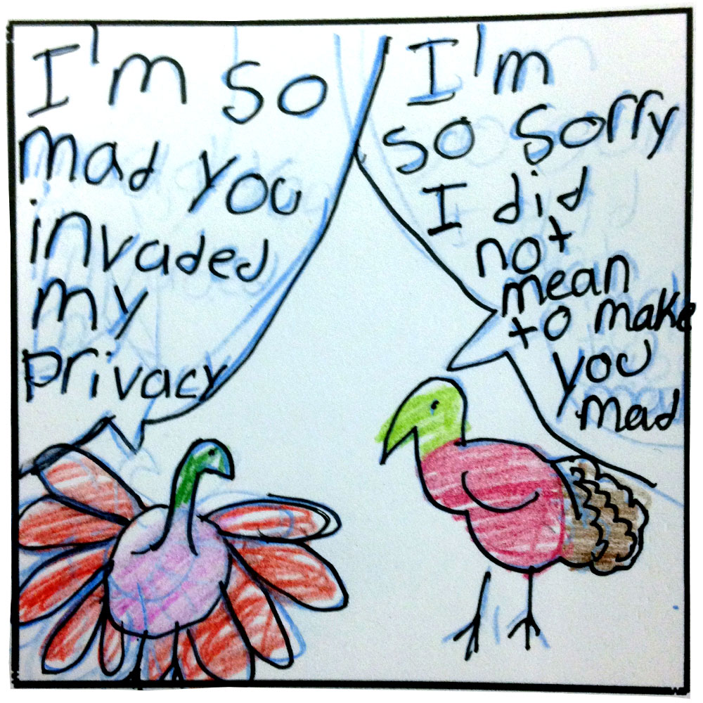
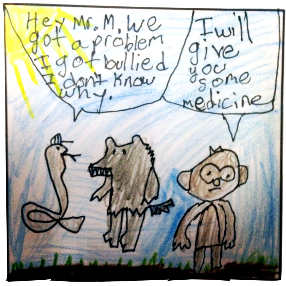
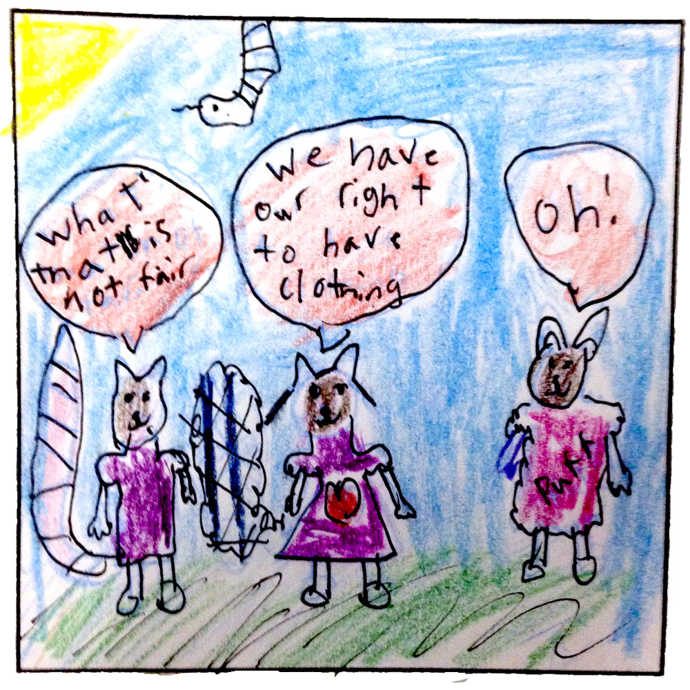
Recently, I came to work with a 9th grade English class who had just read the young adult novels, Speak and Absolutely True Diary of a Part-Time Indian. Both are books about learning to express yourself when everyone around you has already decided who you are. I was asked to help/inspire them to create a short comic based on the reading. I didn't want the students drawing plot points or quoting from the stories, I wanted their comics to deal with a bigger picture. I had to find a common theme.
I settled on the INVISIBLE PRISON. A phrase swiped from the culture blog, HiLoBrow with full credit to Joshua Glenn for creating this striking motif. As I understand it, the Invisible Prison appears when a character is overwhelmed by social, cultural or financial restrictions. It seemed to fit both Speak and Part-Time Indian. I presented the idea to the class and, without a formal definition, the kids immediately found a point of reference. They found something they wanted to say.
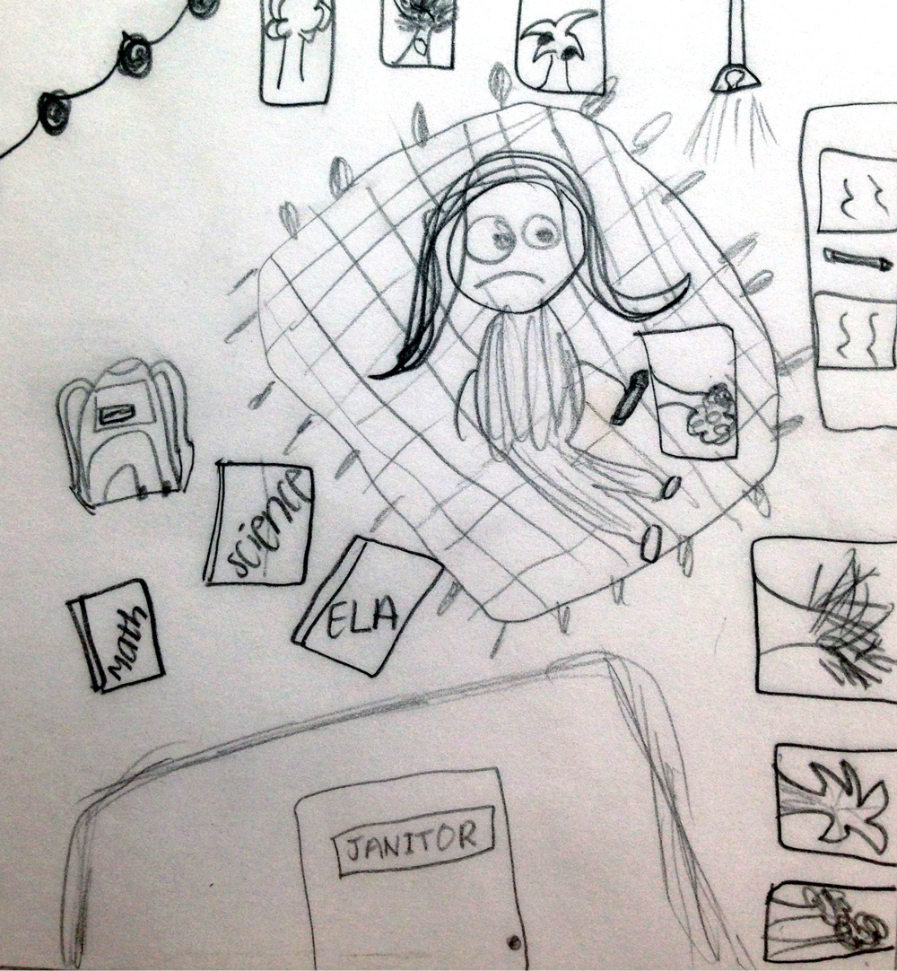
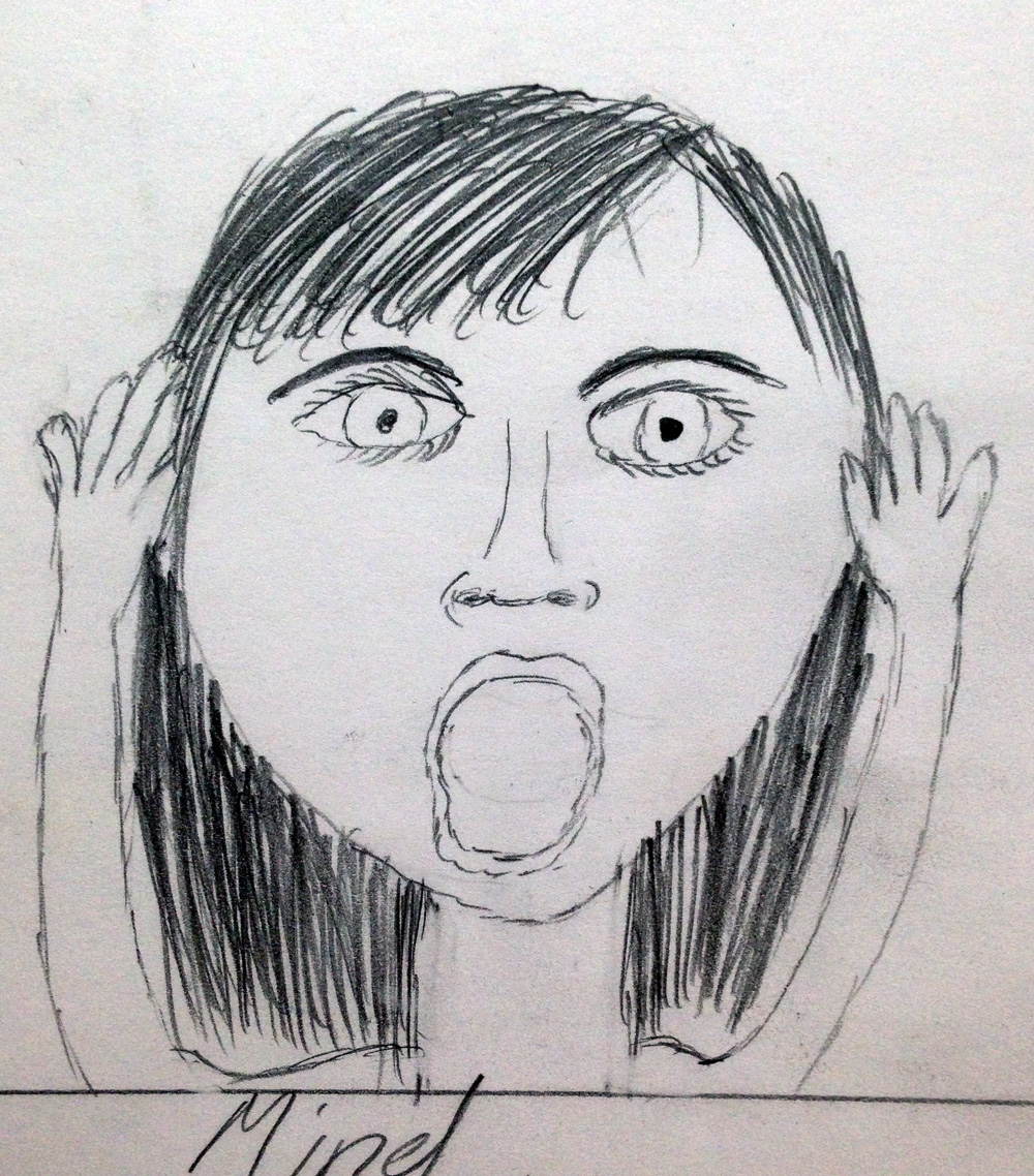
The results were mixed. Some were caught in plot tangles that muddled their work. While others, despite a good idea, were drained from the drawing. Comics take stamina, you know? A few of them, already versed in illustrative art, did great work. In the comics that came out of the project I saw lonely moments and yelling teachers, mean words and hashtags, messy bedrooms and wrong answers. I saw teenagers being honest.
One day, I walked into a room of 9th graders holding a lunchbox full of non-photo blue pencils and Micron Pens. I asked a class full of busy high school kids to take time of out of their lives to draw me their Invisible Prisons and they were cool enough to do it.
Drawing is my First Language
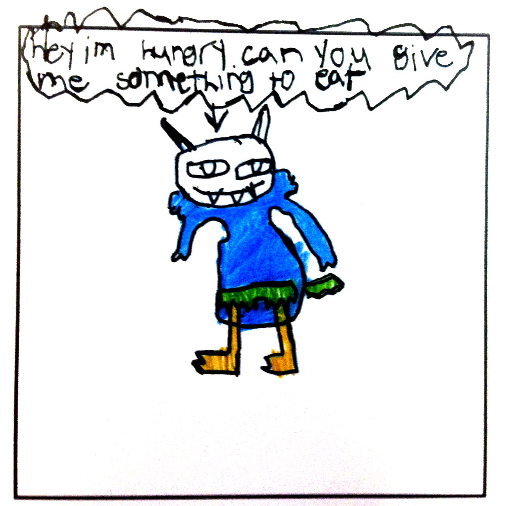
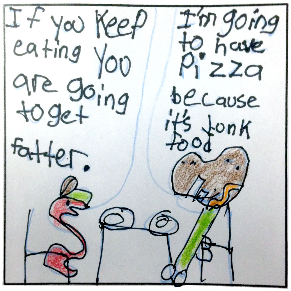
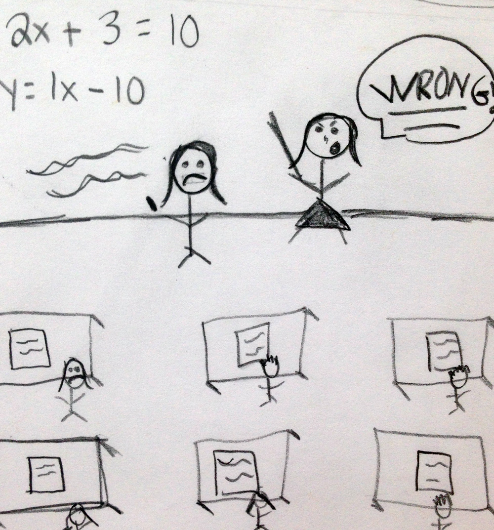
As a kid in school, I wrote a bunch of essays where I was asked to express an opinion on pretty serious topics like endangered animals, climate change and social justice. I remember reading back over those papers and thinking about how cold and assertive my words felt. I remember thinking, is this what writing is supposed to feel like? Of course not, but for lots of people, language can feel like a cold and complex tool, especially if you're a kid who's just starting to figure things out.
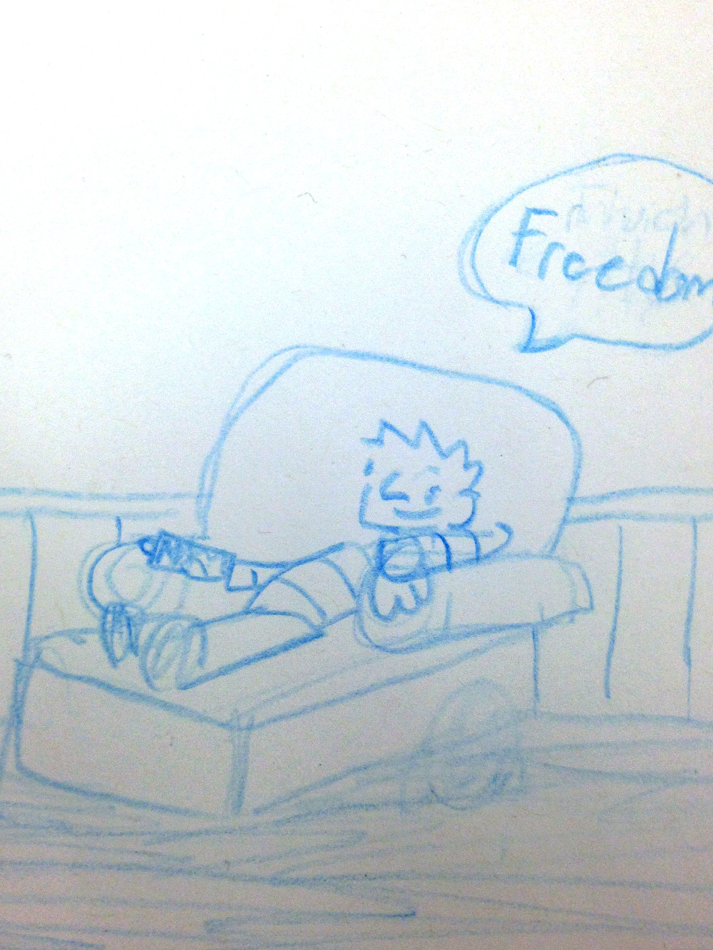
The comics in these pictures are from students I've worked with. They are about serious things like peer pressure, education and health. They express serious opinions, but they are also warm, inviting and hopeful.
For some of us, our words are strongest when they have drawings holding them up.
Just Give Me One Good Reason Why

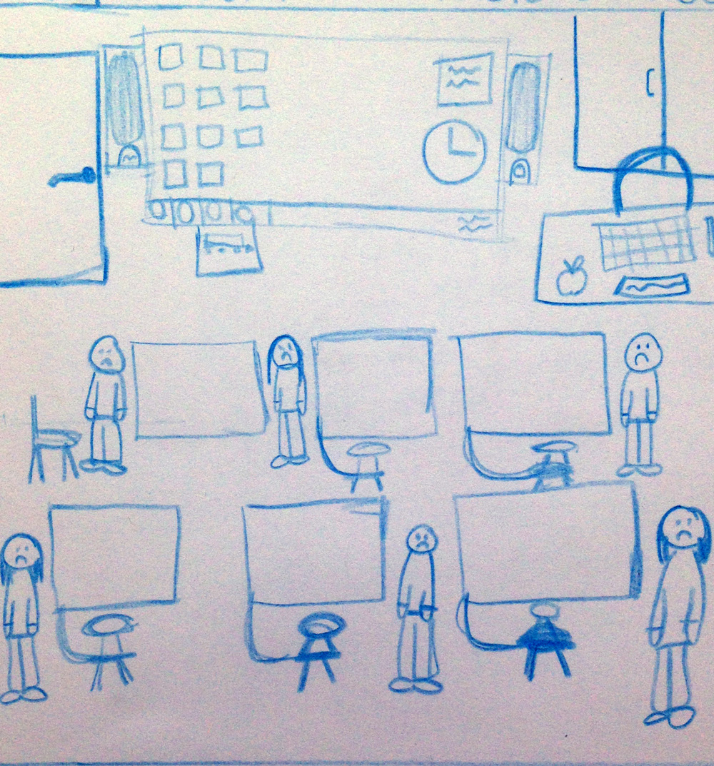
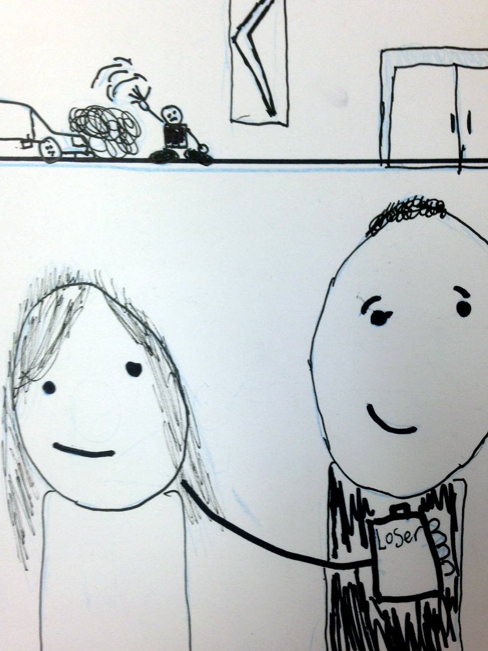
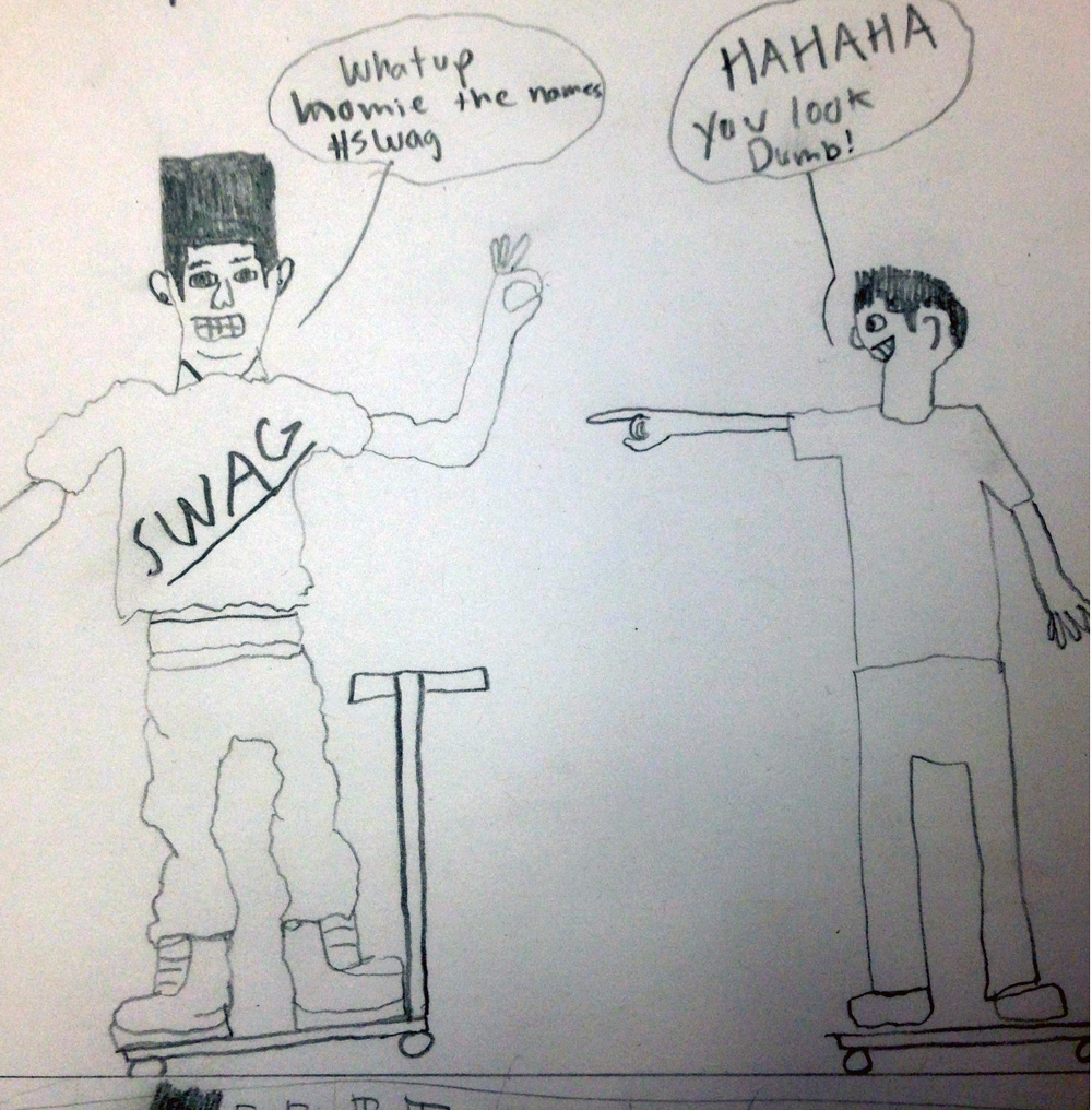
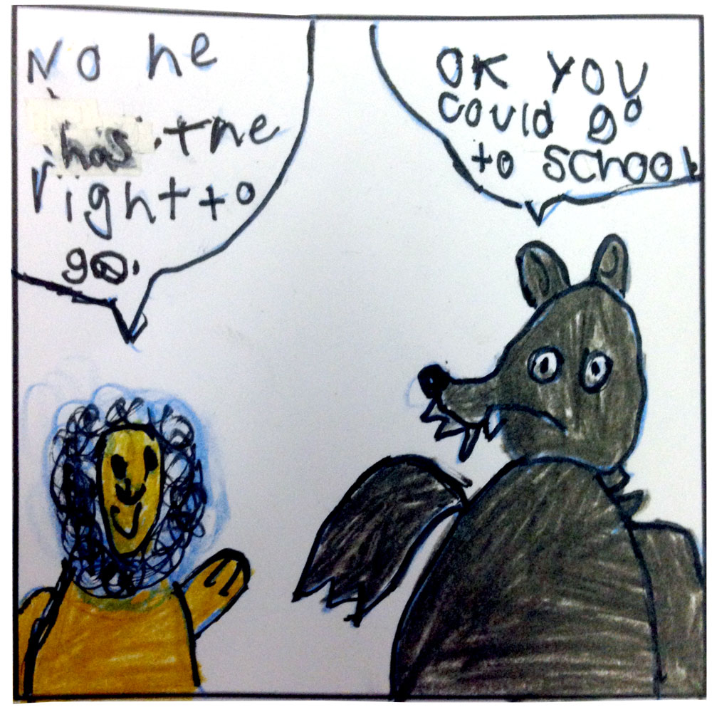
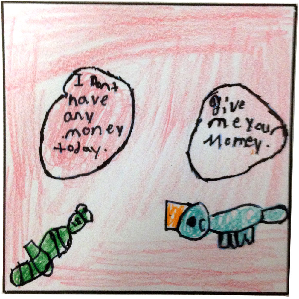
An excerpt from a comic by Ryan, a student at School 2 in Troy, New York.
I used to believe that I never needed a reason to draw comics. I just liked it. But that's probably not 100% true.
It turns out that every comic, every artistic artifact, has a reason for existing. I'm trying harder to help my students find reasons for making comics. The comic above ^ is about Children's Rights. It's a bold statement for a 5th grader to make. Ryan isn't really into drawing but I'd like to think he had fun making this comic.
I'd like to think he discovered a good reason to make art.
A message from Cool Cat
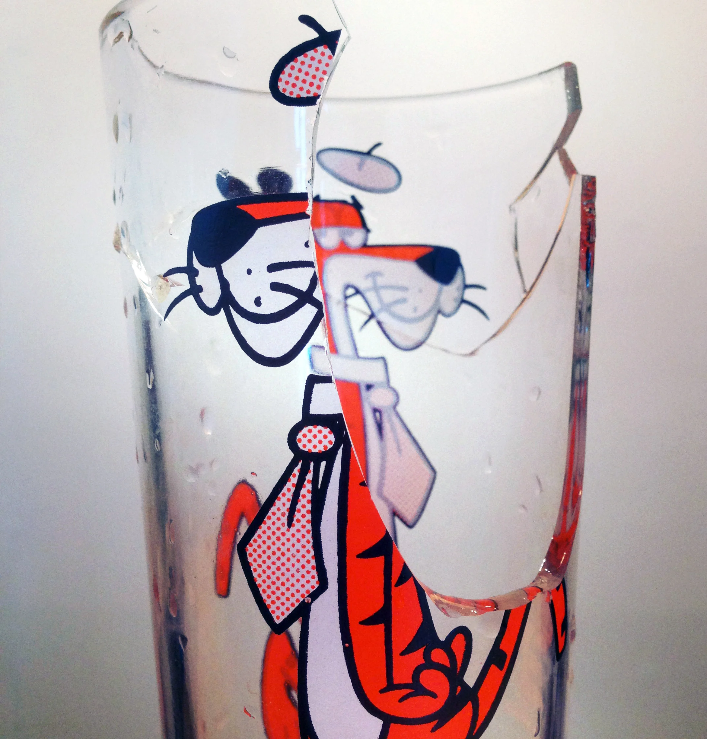
Today, I was reminded how important visual irony is to comics and cartoons.
Thank you Cool Cat.
Let's All Draw Something
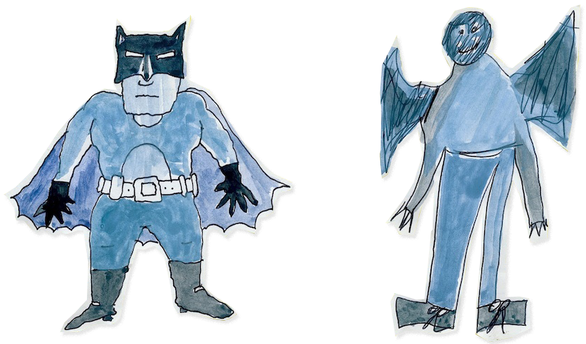
Taken from Lynda Barry's comic essay, "Let's Draw a Car and then Let's Draw Batman"
In situations like this, it seems that 'innocence' and 'confidence' are the two crucial elements in making good cartoons.
Of course, a pencil helps too.
Today in Comics Club
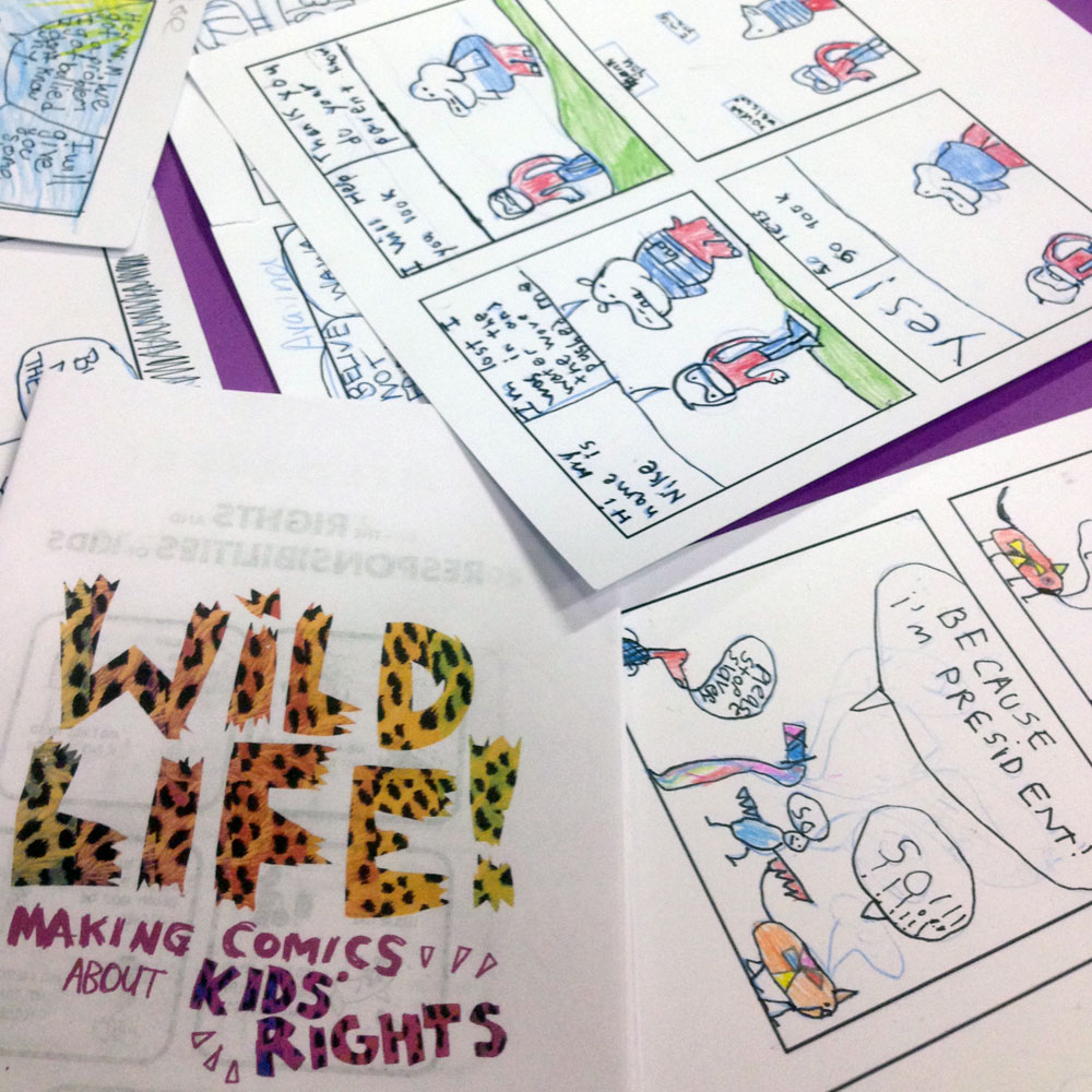
I've been collecting photos of drawings by the awesome kids in my visual storytelling workshops. I get inspired by the energy these young artists bring to cartooning and this is the best way I can think of to share that inspiration.
Everyone of these is a GEM: http://todayincomicsclub.tumblr.com/

How does that make you feel?
It's such an obvious conversation topic. 'The Weather.' Still, think about how much of your personality is controlled by it.

Why is Calvin and Hobbes so timeless? Because, it's about the most important thing in our lives: the weather outside.

What it is & How it is
Thoughts on the over-used phrase: "It's not what you say. It's how you say it."
Art is the WHAT. Craft is the HOW.
You will be remembered by your craft. Spend the time to make it memorable.
Lettering based on the fonts Bemio by JOE PRINCE & Mensch by Morgan Knutson. @ Lost Type Co-op
Painted with Dr. Ph. Martin's Radiant Concentrated Watercolors. Highly recommended
Talking Inspiration
American Elf excerpt. copyright James Kochalka, 2013
I read much of American Elf during a time when my artistic intentions and style were constantly changing. I was desperate for inspiration and connections to other cartoonists. Even in that pre-twitter era, an artist was expected to communicate with their fans. This American Elf strip is proof that James Kochalka understands the value of acknowledging his audience. That faceless person behind the book store counter? It's me. Literally! I've always kept this comic on my desk. It's a little reminder of the relationship between artist, audience and how the line between can be a little blurry sometimes.
How we are Creative: Part 2

Every tool we use is, essentially, designed for productivity. Maybe, everything we create with a tool is just a byproduct of the desire to be productive? At times, that's exactly how I feel. Productivity is satisfying. For a creative person with lots of ideas, a pencil and notebook is a perfect set of productivity tools. The format is eternally compatible, no need to upgrade. There will always be new ways to be productive and it seems like the better ones cost more. That feels unfair if your creativity isn't generating any income. YES, it is important to invest in your ideas. Meaning, you need to spend something. That something can be time, comfort, luxury, etc. Just remember, money isn't your only commodity. The question is: What are YOUR ideas worth to you?
Sans Comic Sans

In late 2011 I began laying out my graphic novel, Witch Knots. I struggled with the choice of using a font for the text or hand-lettering the book. Of course, the best solution was to make a font of my handwriting! The Witch Knots font has been collecting dust in my Font Book for awhile so it seemed about time to pass it along. Sorry, no numerals! Just basic punctuation and a weird currency symbol hidden in a special keystroke. Enjoy!